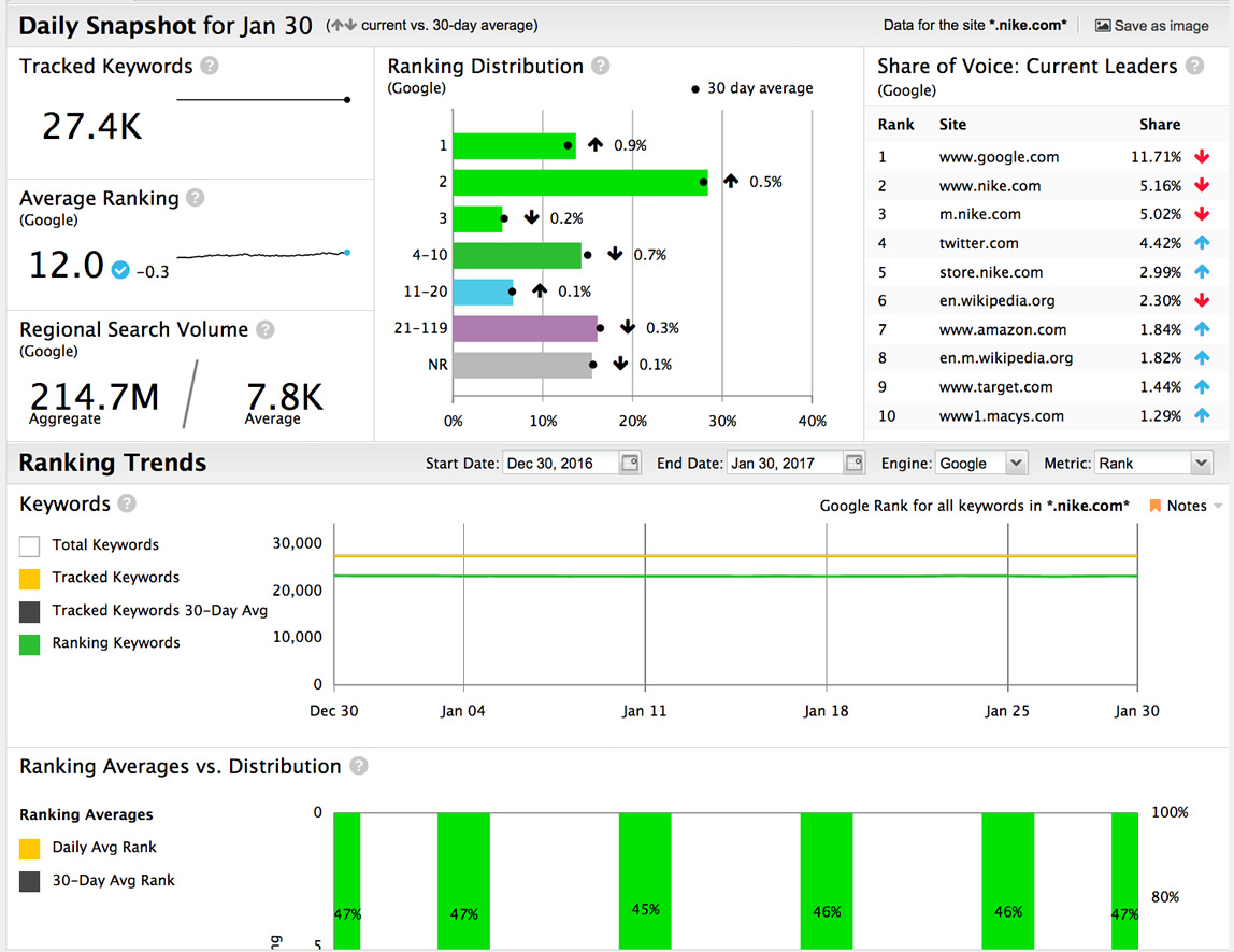
We’re serving up deep data facts on a silver platter thanks to our brand spankin’ new dashboard.
As part of our 2017 mission, we’re proud to announce the release of a brand new dashboard in STAT — one that’s powered by segmentation and serves up all the SERP insights you can eat.
Here’s everything the new dashboard has to offer, and just a glimpse at some of the insights it can help you uncover.
Meet the new STAT dashboard!
Let’s take a tour together and get to know this bad boy.
Instant health-check
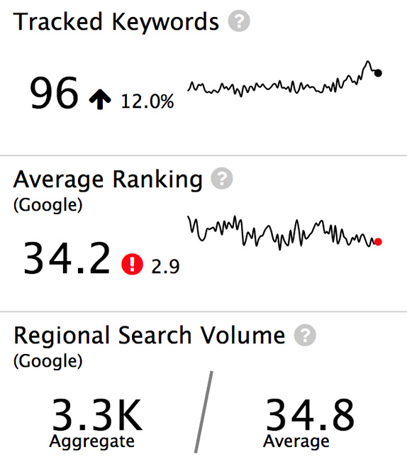
The first thing you’ll see on the dashboard is the Tracked Keywords, Average Ranking, and Regional Search Volume modules of the Daily Snapshot. These will tell you instantly how well your keyword segments (called “tags” in STAT) are performing.
Here we’ve created a dynamic tag that monitors the visibility of the Whole Foods blog. Right away, the Tracked Keywords module shows us that the number of keywords currently tracking in this tag is higher than the 30-day rolling average by 12 percent. This is good news for the Whole Foods content team, as it means that more of their blog pages are earning ranks.
What are your tags up to today?
Check these modules each day for a quick health-check of your keywords.
To check whether those keywords are making any gains or losses, we look to the Average Ranking module, and see that the average rank is a not-so-hot 34. Not to mention the fact that it’s been on a slow, steady decline over the past 90 days, as evidenced by the downward-trending sparkline. (Sad trombone.)
If your current day’s average is above or below your 30-day average, you’ll know right away whether you’re owning those SERPs, or suffering from some kind of setback — maybe a penguin, panda, or possum attack?
We can tell a lot about Whole Foods with these first two modules: that they’re doing a good job getting blog articles indexed, but may need to rethink their content strategy or amplification plan in order to boost their rank.
Looking at the Regional Search Volume module, we’re not surprised to see that this keyword set doesn’t have a massive number of monthly searches per keyword — we’re tracking highly specific terms in a small Vancouver postal code. If you’re looking at broader search terms in a bigger market, you’d want this average to be much higher.
SERP visibility at a glance
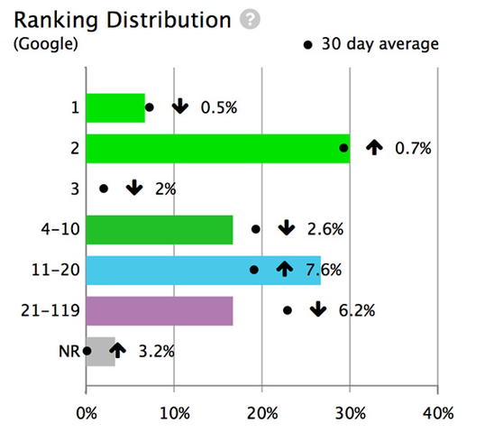
Next, you’ll find your eyes drawn to the colourful Ranking Distribution chart, which shows how your current day’s rankings are divvied up on the SERP, and compares them against the 30-day averages.
Knowing where your keywords rank and which direction they’re moving helps guide your next steps. Let’s look at a Nike example, where golf shoe keywords ranking on page one have dropped nearly five percent.
Where are your keywords clustered?
Use the Ranking Distribution chart to see how your keywords are moving and where they’ve wound up.
Since the number of keywords ranking on the second page has increased by 7.6 percent, we can assume those first-page keywords wound up here, along with a few from the 21-119 rank range. With all of this movement onto the second page, Nike would want to see what’s going on with those particular keywords.
And that’s super easy to do from the Ranking Distribution chart — simply click a bar and you’re magically transported to the list of keywords contained in that rank group.
So, with a quick click on the 11-20 bar, we can see each query in need of a little TLC — and in order to monitor their progress, Nike would want to create a separate tag with those keywords in it.
Instant auto-filtered keyword lists
By clicking on one of those colourful bars, you’ll be magically transported to the corresponding keyword list.
Quick share of voice check
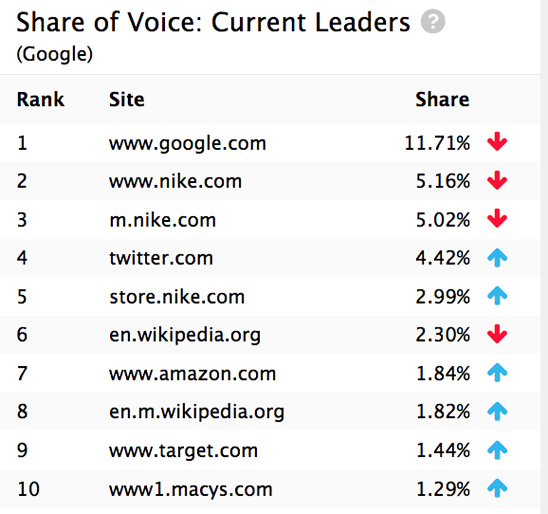
Continuing the tour of the new dashboard, we move over to the share of voice Current Leaders board, which you’ll also find in the Competitive Landscape tab.
The little red and blue arrows in the table provide a visual cue for who’s gaining and losing ground compared to 30 days ago, so keeping an eye on who’s dominating the SERPs for your keyword segments has become that much easier.
Who are your top competitors?
Know who you’re competing against and how well they’re doing with a quick glance at this chart.
Running with our Nike example (pun intended), we can see that Nike.com and m.Nike.com are losing share of voice, but store.Nike.com is movin’ on up.
By clicking the table, you’ll go directly to the Competitive Landscape tab, where you can learn even more about who’s winning all the eyeballs in the segment.
Comprehensive tag analysis
If you’re looking for super-detailed information about your keyword segments, cast your eyes to the Ranking Trends modules. They map both the daily and average keyword counts and rank over time — plus you can zoom in on date ranges, search engines, and rank type, providing you with endless data to get your analysis on.
Here for example, we’re tracking all of Nike’s keywords that return a featured snippet (called “answers” in STAT). We can see in the Keywords chart that the number of keywords generating a featured snippet has increased substantially since mid-August.
Snippets ahoy!
The keyword count has increased, which means more SERPs returning more snippets. W00t!
This means that there are opportunities abound for snippet-snagging and, if they don’t already, that it might be time for Nike to put featured snippets into their SEO strategy.
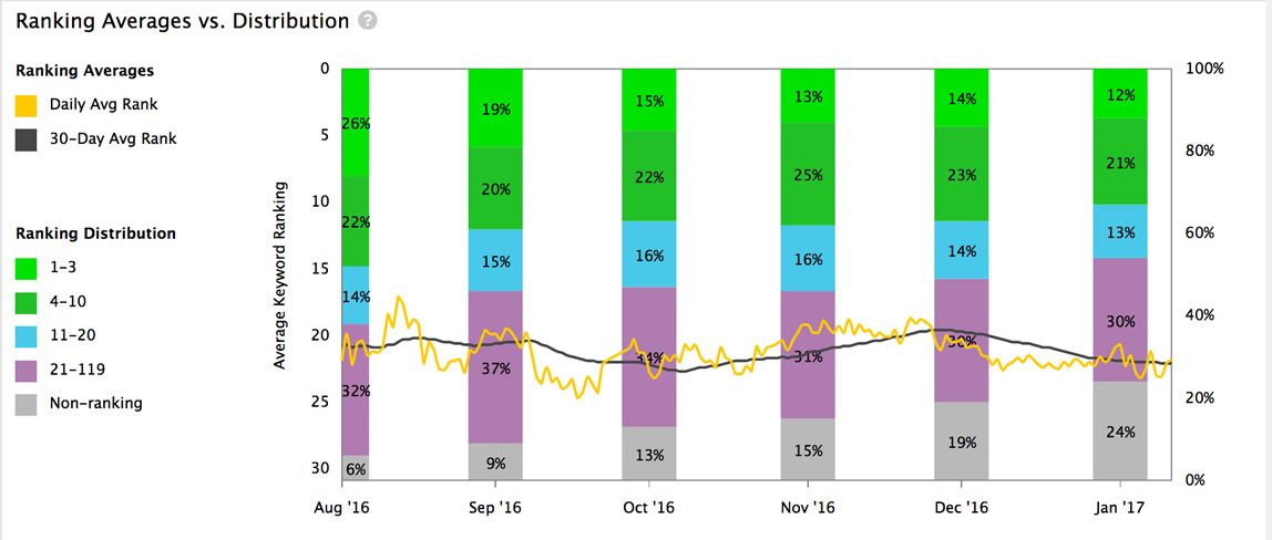
But it won’t be an easy win if they do. Looking at the Ranking Averages vs. Distribution chart we see a few roadblocks.
Chart all the things
Since August, Nike’s set of top five keywords have dropped from 26% down to 12%. Sad face.
First, with an average rank around 20 (which we estimate from the black line), the vast majority of Nike’s keywords aren’t anywhere near the first or second ranking position where featured snippets sit. Next, the percentage of keywords ranking in those top spots have taken a serious wallop over the last 6 months, dropping from 26 to 12 percent.
In other words, while the opportunity to steal a featured snippet has increased dramatically, it already doesn’t appear that Nike has been able to capitalize on it. A fact we would have missed if we hadn’t taken a wide-angle lens to the data.
Lots of little perks
The big stuff is great, but we’re also sticklers for the little things — after all, the devil is often in the details — which is why we’ve included a pile of extras!
Add helpful reminders
Make wee notes to the Keywords chart to help with collaboration and annotation, as well as reminding yourself that a fluctuation was caused by adding new keywords or Google unleashing an algorithm update. You can even add notes to future dates so that you’re prepared when current schemes hit the SERPs.
Keep current on STAT updates
See system notes from STAT (that’s us!) in the Keywords chart when things like data backfills and changes to site settings occur.
Uncover even more
The new dashboard is a great place for n00bs and vets alike to learn about the kinds of insights waiting to be uncovered in STAT. We’ve added little question marks in each module that tell you exactly how the data is generated, and link you to helpful articles in the knowledge base for even more learnin’.
Not sure what something is all about?
Just hover over these itty bitty question marks and you’ll get a description of the feature and a link to more help!
Share your data quickly
With the click of a Save as image button, you can quickly share your dashboard insights with clients, teammates, and management. Who won’t love looking at colourful charts jam-packed with useful information?
Get dashboardin’
So it’s time to get in there! We hope you enjoy using the dashboard as much as we enjoyed working on it. And if you need any help uncovering insights in your data in your, or how to run reports to dig even further into what you find, we’re ready and waiting for your emails.
If you’re curious about how STAT and the new dashboard can help your SEO adventures, let us show you with a personalized demo.
